

Midcentury Modern Colors

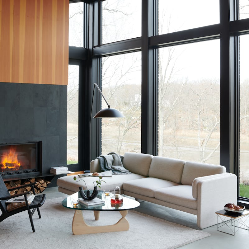
When someone mentions midcentury modernism, what colors come to mind? Chances are, you think of the olive, gold, teal, and orange tones popular in textiles from the late fifties and early sixties. Or maybe you’ve seen so many recent midcentury reproductions upholstered in beige or grey that you think of the era as a time of neutrals. Actually, interiors were often quite colorful and full of contrasting tones and exciting patterns. Don’t let the many solid grey and beige midcentury furniture reproductions in home furnishing stores fool you. Midcentury modern colors were often vivid and varied.
Midcentury modern (also known as MCM) color palettes for interiors changed significantly from the early 1940s to the mid-1970s. Undertones went from grey to white to shades of brown over time, but in the U.S., the period was decidedly not a neutral one, colorwise. Let’s take a look at some examples from the main color palettes of the period.
To learn more about the continuing popularity of midcentury modern interior design, see my article, Midcentury Modern Interior Design.
The War Years: Late 1930s to Mid-1940s
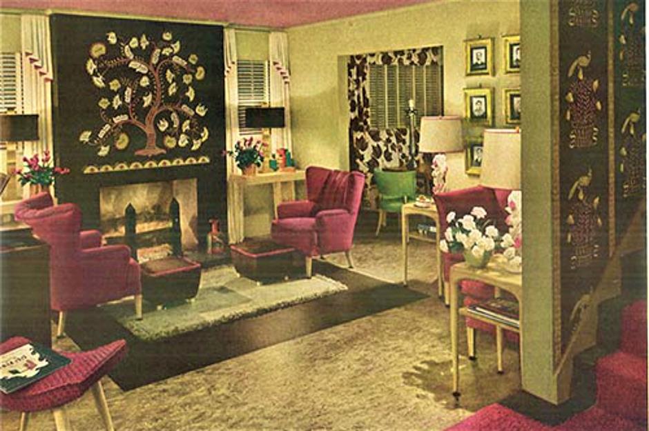
Interiors of the 1930s and early 1940s tended to feature colors with grey or white undertones instead of warmer undertones. Mauve, maroon, dusty rose, sage green, forest green, and peach were popular. Complementing maroon tones with green hues, light or dark, was common. Bright, clear colors like red, true blue, and yellow were popular in kitchens. Many bathrooms built from the 1920s to 1940s boasted boldly colorful contrasting tile and fixtures. By the late 1940s, pristine white or pastel bathrooms that showed off cleanliness became more popular again. However, there were still plenty of unusually colorful bathroom tiles and fixtures. Outside the home, cafes and diners often used more saturated colors and bright lighting to lure customers.


Indoor lighting was dimmer than we’re used to. Many rooms lacked overhead lighting. As a result, people relied more on table and floor lamps in living rooms and bedrooms. Table lamps were often quite sculptural and colorful. But that didn’t mean people necessarily left walls white to create brighter interiors. Many homes had dark or colorful wallpaper. Walls of light to medium green with dark wood baseboards and furniture were also popular.
MCM style spread slowly before the 1950s
The sleek lines and lighter-toned woods we associate with MCM style didn’t take over from more traditional wood furnishings until the 1950s. After a ten-year depression and four years at war, people of the U.S. didn’t have money to spend on new furniture. Some furniture companies had shut down during the war and had to retool. When they went back into production, they started by producing pieces in their existing styles from the early forties. Mostly, people continued to make do with older, usually darker woods until the economy had thoroughly rebounded and they could afford more modern pieces. So midcentury modern style took a few years to really ramp up after the war.
The post-war baby and housing booms eventually led to a need for lots of new homes and furniture. However, it took a few years for the sleeker modern shapes imported from Europe to really take hold in the U.S. When they did, the palette of midcentury modern colors shifted as well.
Late 1940s & Early 1950s
In the forties, pure white kitchens with red accents (or dark green trim) were common. Accent colors decorated countertops, wallpaper, canisters, and small appliances. By the early fifties, there was a vogue for kitchens with pastel wood or metal cabinets, floors, and appliances. Soft yellow, pink, or turquoise kitchens felt bright and lively. Pastel tiles and fixtures—oh, so many pink tiles!—were also popular in bathrooms.


Lively wallpapers were nothing new in the 1940s. However, vibrant Scandinavian wallpaper in fantastical botanical designs by Josef Frank were different from standard wallpaper designs. Svenkst Tenn’s modern reissues of Frank’s designs still look utterly fresh and contemporary today, rivaling the wildly popular botanical wallpaper designs by favorite design sources like Rifle Paper Company.
Colors popular in the 1940s were often clear, with bright undertones. Because home decor was considered the domain of women, pink abounded. Pink walls and ruffled sheer curtains were common in bedrooms, bathrooms, kitchens, and formal living and dining rooms. More tailored decor reigned in dens, basements, and family rooms. In the early 1950s, colors and patterns loosened up, and decor became more casual throughout the home.
MCM wasn’t the only popular style
While midcentury modern style is what we tend to think of when we think of the 1950s and 1960s, it had heavy competition. The style known as Early American (or Colonial, or Colonial Revival) was well established by the 1940s. It continued to sell well right up through the seventies, and some of its shapes have never really gone out of style.
Early American furniture and associated decor was based on traditional New England style—think Chippendale tables and chairs, highboy chests, Windsor chairs with curvy spindles, braided oval rugs, and Colonial-style brass candlesticks and chandeliers. Colonial furniture often has dark walnut or dark reddish cherry stained finishes. These darker pieces are nowadays referred to as “brown furniture,” and they’ve been largely out of fashion since the 1990s. However, brown furniture is starting to make a comeback. While not currently hot in the way the sleeker, paler midcentury modern designs are, Early American designs are often classics that fit well with traditional home styles.
If you like Early American shapes but not their dark woods, they can look great painted in black, white, or even bold colors. (I love a painted Chippendale highboy in a matte teal or a lacquered red finish myself.) Lots of modern furniture restorers love finding deals on outdated Colonial as well as MCM desks, dressers, and bedside tables, then refinishing them. They often restore old brown furniture by painting it in vibrant colors that make it instantly bold and fresh.


Mid-1950s – Mid-1960s
Kitschy patterns like boomerangs, starbursts, rockets, and atomic symbols showed up around the mid-1950s. Sometimes they appeared in large swaths on linoleum or vinyl floors, kitchen counters, or curtains. At first, patterns used chalky white with pastel or vivid colors. These included baby blue, bright turquoise, pure orange, peony pink or pale pink, or a slightly greyed version of yellow. They were often outlined in pure black, so patterns popped.
Autumn colors hit the big time

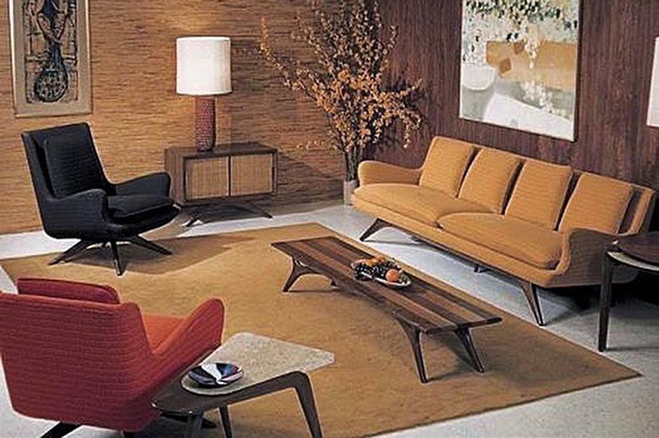
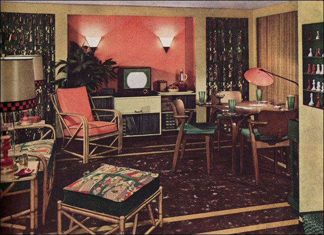
By the mid-fifties, the crisp colors of the early 1950s had largely made way for browner hues. These were considered more sophisticated and closer to nature. Until the 1960s, kitchens were often the exception to this transition. They were expected to look sparkling clean—whites and crisp colors made them feel fresher. Classic midcentury modern colors—golds, oranges, browns, greens, and beiges (in addition to greys, blues, greens, and blue-greens)—were more popular in the rest of the home.
MCM rooms of the fifties and sixties often combined warm and cool colors to create energizing contrasts. During the matchy-matchy forties, rooms often used the same color or pattern throughout. By the fifties, mixing colors of the same intensity in a room felt more modern and casual. Blues were often paired with caramel or goldenrod yellow. Turquoise frequently danced with orange. Olive green and grey created a cool vibe, like moss growing on a riverside stone. Mixed cool and warm hues balanced each other out, and made rooms feel lively.


The mid-to-late 1950s

As the 1950s progressed, pastels became less popular, and more earth tones entered the palette. Coral, goldenrod, and cocoa where everywhere. Fifties interior design palettes also included green-based blues. These went from light turquoise in the early 1950s, to darker teal by the early 1960s. There was always interest in true blues (i.e., blues without green) and midrange greys. These were often used to contrast with warm golden or orange colors.
Baby blue might appear in bathrooms or bedrooms, but medium true blue was more common among later MCM colors, especially in upholstery. Greens remained common in the 1950s and 1960s. While clear minty pastels and dark forest greens were more common in the 1940s, yellow-greens were popular from the 1950s to the 1970s. Sage (a greyish pale green) was used throughout the period.

The more long-lasting interior design color palettes we associate with the late 1950s to mid-1960s included many greens. These included olive, darker avocado, yellowy spring green, sage, and celery. Other popular colors during this period including goldenrod, teal, orange shades from faded coral to tangerine, blue-grey, brick red, and soft pink.
Heathered grey, tweedy fabrics similar to men’s suiting fabrics appeared on a lot of office furniture. Midrange blues and greys were staple colors of office upholstery as well.
Homes were anything but colorless

By the late 1950s, high-end Scandinavian designers had influenced the U.S. market. They emphasized texture, highlighting artisanal skill in ceramic and glass elements, and letting wood tones speak for themselves. Letting color and pattern do all the heavy lifting was passé. Homes were airier and brighter. Colors were usually less saturated and dark than they had been in homes of the 1940s. But even in sophisticated homes, color on walls and upholstery was the norm, not the exception.
Since about 2010, midrange grey has become a popular color for reproductions of MCM furniture. However, neutral upholstery was less common during the midcentury period. Back then, sofas and chairs wore dark olive, forest green, teal, maroon, harvest gold, medium blue, or burnt orange upholstery. Leather seating was often dyed caramel brown or black. Grey was just one option out of many, and wasn’t the default.
Bold prints made grand statements

Chairs and sofas were often upholstered in printed fabrics or brocades. Nowadays, we worry about patterns or colors going out of fashion. We tend to avoid big color commitments, opting for neutral walls and furniture to be safe and make resale easier. “Safe” was definitely not the byword of midcentury design.
Showrooms full of MCM reproductions nowadays mislead buyers into thinking this is how midcentury homes looked. They were rarely monochromatic. While fully neutral rooms were favored by some early modernist designers of the 1920s and 1930s, most people even then preferred more color and pattern in their homes. Colorful accents were seen as more homey, comfortable, and welcoming. Even the homes and offices of major MCM designers like Arne Jacobsen and Frank Lloyd Wright, who embraced neutrals and emphasized wood, show that they used and enjoyed color and pattern in their own lives.
Textiles & wallpaper told stories

Printed textiles were big in the fifties and sixties. While some now look dated, many patterns from this period still look fresh and appealing today. Looking for midcentury-style prints and patterns for furniture, curtains, pillows, or runners? Print-on-demand textile companies like Spoonflower print new, vintage-style patterns on many types of fabrics, including upholstery fabrics.
Patterned wallpaper was also popular. Popular motifs included Western themes for kids’ rooms, nautical motifs for dens, and flowers or spice racks in kitchens. Fuzzy flocked wallpapers sometimes showed up in hallways or bedrooms.
Bold, oversized patterns by the Finnish design house Marimekko first appeared in 1951. They still make wonderful midcentury modern statement pieces with a number of the patterns they originally created in the 1950s and 1960s. These add great excitement and style when used around the home, especially in curtains, runners, throw pillows, or bedspreads.
Money-saving tip: Marimekko fabrics can be expensive, but even a novice at sewing can repurpose a vivid sheet or duvet cover to create curtains or throw pillows. I’ve recently seen sheets in some of their more popular patterns at discount prices at stores like HomeGoods and Macy’s.
Late 1960s – Early 1970s
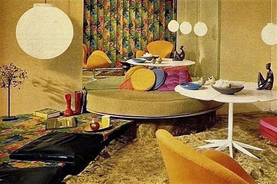
During the 1960s, midcentury modern colors in home interiors tended to be bolder and more saturated. By the late 1960s and early 1970s, synthetic fabrics and furniture materials became more popular. Vivid synthetic upholstery fabric and glossy vinyls and plastics began showing up on home furnishings.

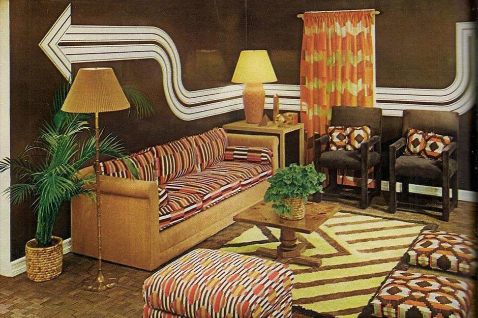
While clothing colors of the late 1960s and 1970s ran the gamut from drab to bright to earthy, home interiors tended toward warm autumny colors. Of course, there were brilliant exceptions. Look at British clothing designer Mary Quant’s vibrant pink, red, and silver extravaganza, designed by Marion Best in 1967. People with pop art sensibilities and a love for all things mod incorporated bright color, shimmering metallics, and rounded, glossy plastic pieces into their homes. Interior decor colors became more intense as the 1970s neared. But across the U.S., roughly carved, blocky, and dark Mediterranean-style furniture took over from the smoother, paler, simpler Scandinavian style. Colors with brown undertones, dark wooden paneling, and dark brown furniture made early seventies’ interiors broodier. By the mid-seventies, the organic shapes, smooth natural materials, and airier Scandi-infused style so popular in the early 1960s were things of the past.
Earth, sky & sun—the colors of the seventies
By the early seventies, late midcentury modern colors were mostly brown-based—shades of goldenrod, olive, rust, or chocolate. Oranges of all sorts had a major moment, from bright tangerine to burnt orange to rusty reddish-brown. Browns in milk chocolate and dark chocolate shades were everywhere. Mustard and “harvest gold” furniture, carpeting, wallpaper, bedding, and upholstered furniture were all the rage. Latch-key kids opened cans of Spaghetti-Os in fluorescent-lit yellow kitchens with bold oversized floral wallpaper. My mom made macrame wall decor and plant hangers for our family room, and hung a big, bold print of Van Gogh’s Sunflowers over the mantel, picking up the golden yellow of the wallpaper and the striped velvet sofa.


Even during the earth-tone-loving 1970s, blues were always in fashion, but the particular hues and saturation varied over time. From the late sixties through the seventies, home decor tended to include midrange true blues instead of the greenish-blues of the fifties and sixties.
But all trends must end. The long midcentury love affair with warm tones eventually petered out. By the early 1980s, cooler colors like mauve, soft pink, teal, and turquoise came back into vogue. Pastels were set off by bold black accents, giving them a New Wave edge. Brown had at last left town.
The rise of synthetic fabrics
Colorful patterns and textured fabrics were popular on furniture by the late 1960s and into the 1970s. By this point, upholstery was often woven of synthetic fibers that resisted staining or fading. Imagine a bold living room with a rust-colored shag carpet, an armchair fully upholstered in orange and gold floral brocade, and a striped velvet recliner in three shades of olive. That, my friend, was the living room of my early childhood—and it was oh, so stylish for its time. At least that fabric was soft; my stepdad’s Herculon olefin sofa in an oversized brown-on-cream plaid was so scratchy, its arms made my elbows itch. But that upholstery was 100% waterproof—you could spill a whole cup of Hawaiian Punch on it without a worry. Nothing could stain that ugly couch.
Shiny textured vinyl or corduroy-covered beanbag chairs in brown, gold, white, black, or blue dotted family rooms across the land in the seventies. Lumpy brown sofas, chairs, and ottomans covered in Naugahyde fake leather made squishy sounds as people plopped into them to watch The Partridge Family and The Brady Bunch. Vinyl, plastic, nylon, and other synthetics replaced natural materials all over the house. And yes, the tackiness factor was off the charts.
What Colors Make You Feel Most at Home?

Midcentury designers created plenty of colorful and patterned furniture. But modern tastes vary. After years of seeing neutral rooms all over websites, showrooms, and TV shows, color is back. Interior designers and retailers showcase bolder paint, fabric, and wall coverings. Greens, lavenders, pinks, and oranges are named colors of the year. But what if you prefer neutral home decor?
Perhaps you love the textures and shapes of midcentury modern interior design, but can’t see going for a bold sofa, wallpaper, or window treatment. That’s fine—do what makes you feel good! Modernists of the 1930s like the architects and designers of the Bauhaus movement tended toward neutrals and minimalism. So did popular home furnishings retailers of the 2010s, who prized texture over color. You can, too. You don’t have to follow trends that don’t work for you.
Expect your tastes to change

It is true that repeated exposure to colors and prints does make us more comfortable with them. However, after years of being surrounded by solid beige, grey, or white, you may find patterns or saturated colors out of your comfort zone. As more colorful interiors slip back into style, you may find in a year or two that you actually like emerald green, autumny orange, sunny yellow, even misty lavender. This is standard and normal. As we’re exposed to more color and pattern, we get more comfortable with it.
If you just want a light wash of color in your home—or even none at all—go for it. Your taste matters far more for your home than so-called tastemakers’ choices. I love color and pattern, but even I have strong negative reactions to some hues. Follow your heart. You deserve to live in an environment that helps you to feel comfortable and happy.
Color can bring life to a room
While it’s perfectly fine to keep colors and patterns subtle, consider pulling at least some color into your space to give it some life. A fully neutral space can feel clinical or “designed” instead of natural. Texture and shape are great as far as they go, but it’s color that usually creates the greatest emotional reaction.

If a color brings you joy, find a place for it in your home. Don’t be afraid to let a colorful element draw some attention. Start with small, impermanent things. Try a colorful pillow, towels, a table runner, some dishes, a tray, or a patterned rug. A soft and colorful throw or a painted bench at the foot of your bed can make your bedroom feel so inviting. It’s good to feel invited to feel cozy and happy in your own home.
At top:
Midcentury fabric designs by British textile designer Lucienne Day (1917–2010)

